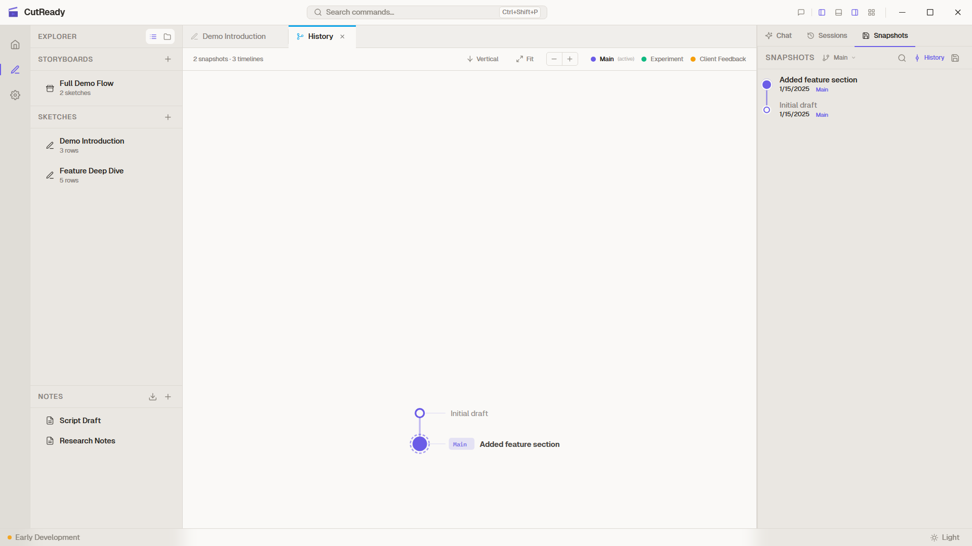
History Graph
The History Graph is a full DAG (directed acyclic graph) visualization of your project’s complete history across all timelines. It shows every snapshot, fork point, and merge commit in a single interactive view.
Opening the History Graph
Section titled “Opening the History Graph”Click the History button in the Snapshots panel header. The graph opens as a dedicated tab — like Settings, it’s a singleton that you can keep open alongside your sketch editor.
Reading the Graph
Section titled “Reading the Graph”Each circle in the graph represents a snapshot (saved version):
- Filled circles — Regular snapshots
- Nodes with a ring — The current HEAD position
- Merge nodes — Snapshots with two incoming edges (created by merging timelines)
Lanes and Colors
Section titled “Lanes and Colors”Each timeline gets its own colored lane:
- Main is always the leftmost lane
- Forks appear in additional lanes to the right
- Colors are consistent with the timeline selector — the same color you see in the dropdown appears in the graph
Lines connecting nodes show parent-child relationships:
- Straight vertical lines — Sequential snapshots on the same timeline
- Diagonal lines — Fork points where a timeline branched off
- Converging lines — Merge commits where timelines were combined
Labels
Section titled “Labels”- Branch tips show the timeline name as a badge (e.g., “Main”, “Experiment”)
- Snapshot messages appear on hover or alongside nodes
- Timestamps help orient you in the history
Interacting with the Graph
Section titled “Interacting with the Graph”Click a Node
Section titled “Click a Node”Clicking a snapshot node in the graph:
- Switches to that timeline (if you’re on a different one)
- Navigates to that snapshot in the linear view
- Shows the snapshot’s details (message, date, files changed)
Orientation
Section titled “Orientation”The graph supports two orientations:
- Vertical (default) — Time flows top-to-bottom, most recent at top
- Horizontal — Time flows left-to-right
Both orientations show the same information; choose whichever feels more natural for your workflow.
Ancestry Indicators
Section titled “Ancestry Indicators”When viewing the linear snapshot list for a specific timeline, the graph shows ancestry — snapshots inherited from the parent timeline appear in the parent’s color. This helps you understand where a fork originated and how much history it shares with other timelines.
Remote Tracking
Section titled “Remote Tracking”When a remote is configured, the History Graph shows remote state:
- Remote branch labels appear alongside local ones (e.g., “origin/main”)
- Divergence is visible — local-only snapshots appear beyond the remote marker
- Incoming snapshots (after fetch) appear as distinct nodes
See Remote Sync for details on configuring a remote.
Technical Details
Section titled “Technical Details”- The graph is rendered as SVG using a custom layout engine
- Layout uses topological sorting with lane assignment per timeline
- Merge edges are drawn as smooth curves between lanes
- The graph recomputes on save, merge, or timeline switch
- Performance is optimized for projects with hundreds of snapshots